"Barby" Website
The "Barby" club website is an e-commerce platform for live shows and events
Tools used: Adobe XD , Photoshop


The Old Website
Landing page


Ticket Order Page

Artist Page

Sights
The website goal is to sell tickets for shows happening in the club
It gives the user information about upcoming shows and about the artist
From a user experience perspective, the site effectively guides users straight to ticket purchases and encourages them to buy the last remaining tickets for shows.
Things That Work Well
Everything is straightforward, assuming that users visiting the site already know about the "Barby" and simply want to purchase tickets.
Upcoming shows are displayed by date, making it intuitive for users who know they want to visit the "Barby" and just need to select the best day.
The site provides updates when only a few tickets are left for a show.
Things That Are Missing
The site lacks a search option.
The artist's page could provide more information about the artist and the show itself.
Since this is an e-commerce platform for a physical venue, the website’s design should reflect the atmosphere and aesthetics of the place.
The user experience feels outdated, with little consideration given to how it could be improved.
The Mission
To enhance the user experience and fully meet the users' needs
To capture the "Barby" vibe and make the site feel like a live show experience.
The Solution
A Clean and organized landing page with new options
A menu header with new widgets was added, allowing users to easily find what they need.
One of the new features is a selling forum, enabling users to sell tickets they can't use for any reason, instead of posting on Facebook or using other methods.
On this page, users can find the most relevant information:
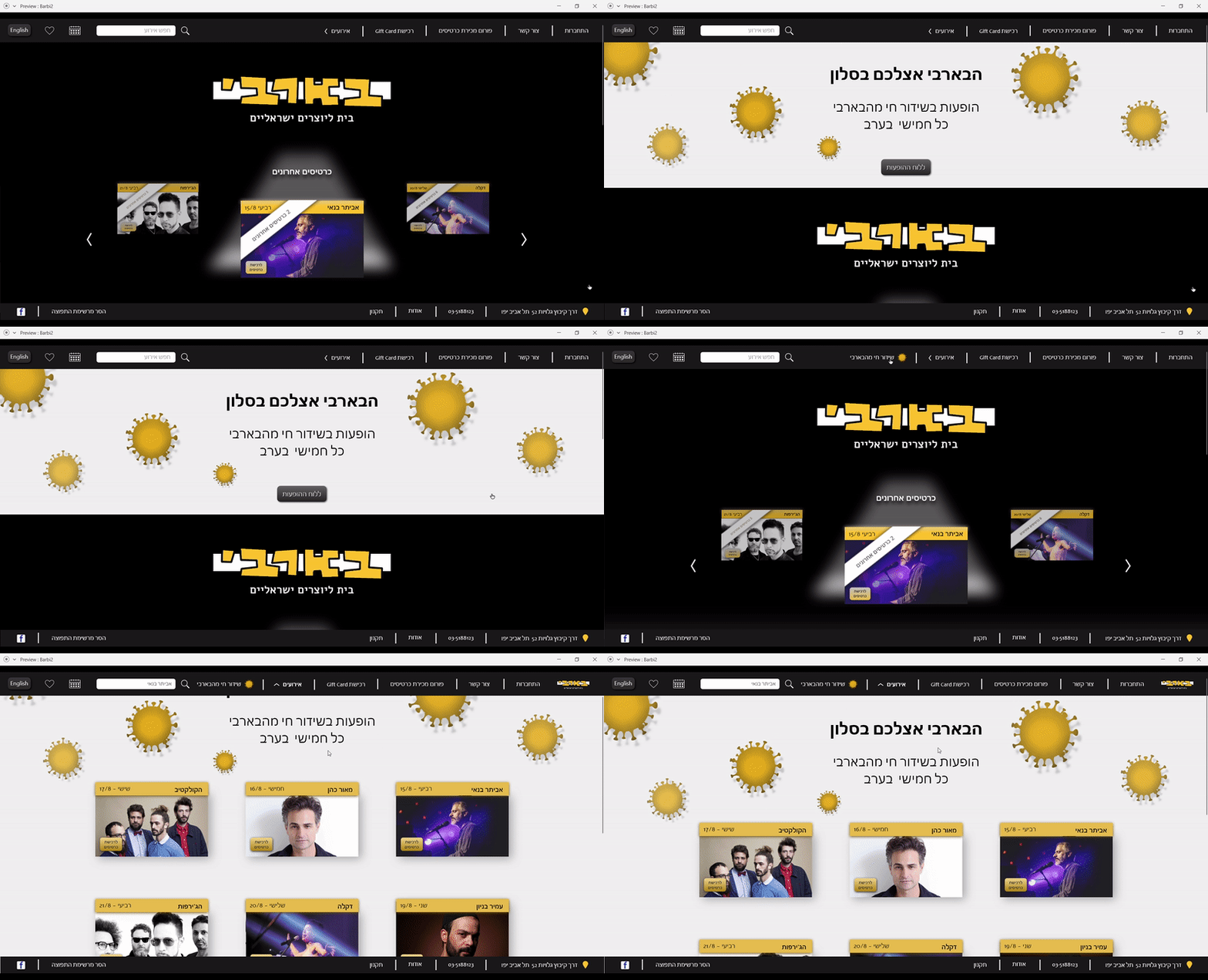
A "corona" banner that slides down and goes back up with a click, "Limited ticket" section for upcoming shows, this week's shows, a "make your own event" option, and footer with contact details.

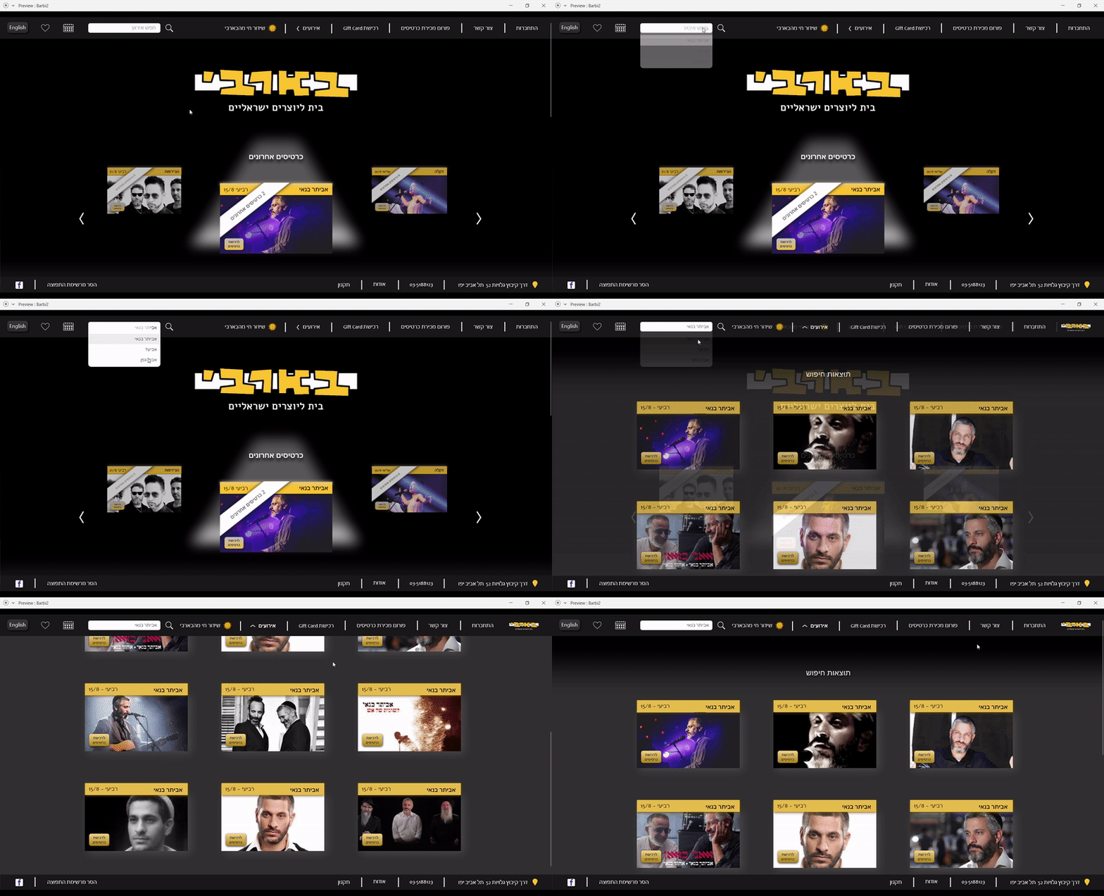
A Search option
A smart searching bar, so users could easily find exactly what they are looking for.


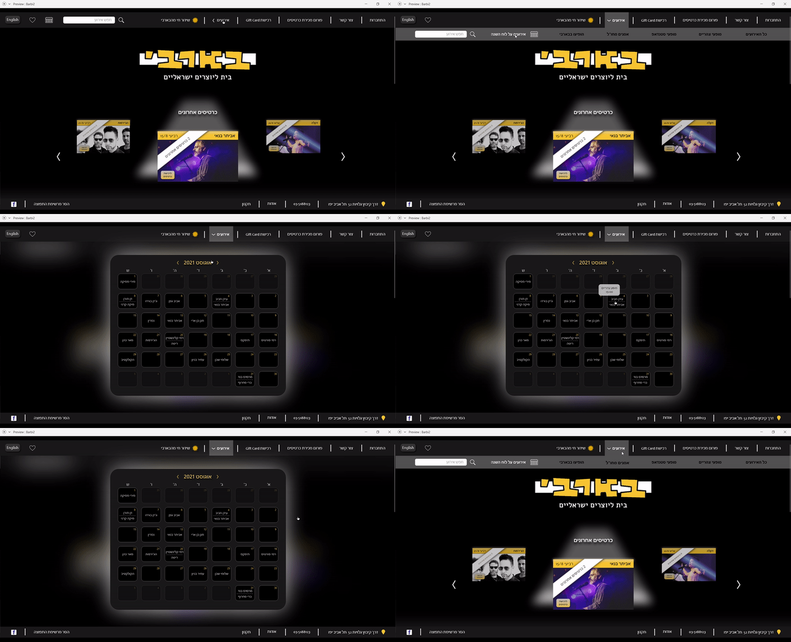
Presenting events on calendar
With the new calendar view it's easier to find future shows.
the calendar icon was placed on the left side of the header, and accessible from any page.
when users click on "events" the icon moves to the secondary menu, so it appears even more clearly.

The real Barby's atmosphere
Since this is a live show club’s website, it should communicate the vibe of the place.
The artist is in the spotlight, on the stage, and on the website.
The dark background and spotlight reflects the real experience of being in a live music show.


For the users convenience, I added a like button to artist pages.
By using the like function, users will be notified of future shows from this artist and they will never miss a show.
Press "Like" and get notification about up coming shows
Corona virus - what can we do?
While I was working on this project, the coronavirus started to affect the economy.
Part of the mission I was embarking on was to ask: what can a place like "Barby" do during these uncertain times?
Online shows were the answer, so I designed a pop-up message and a specific page for them.


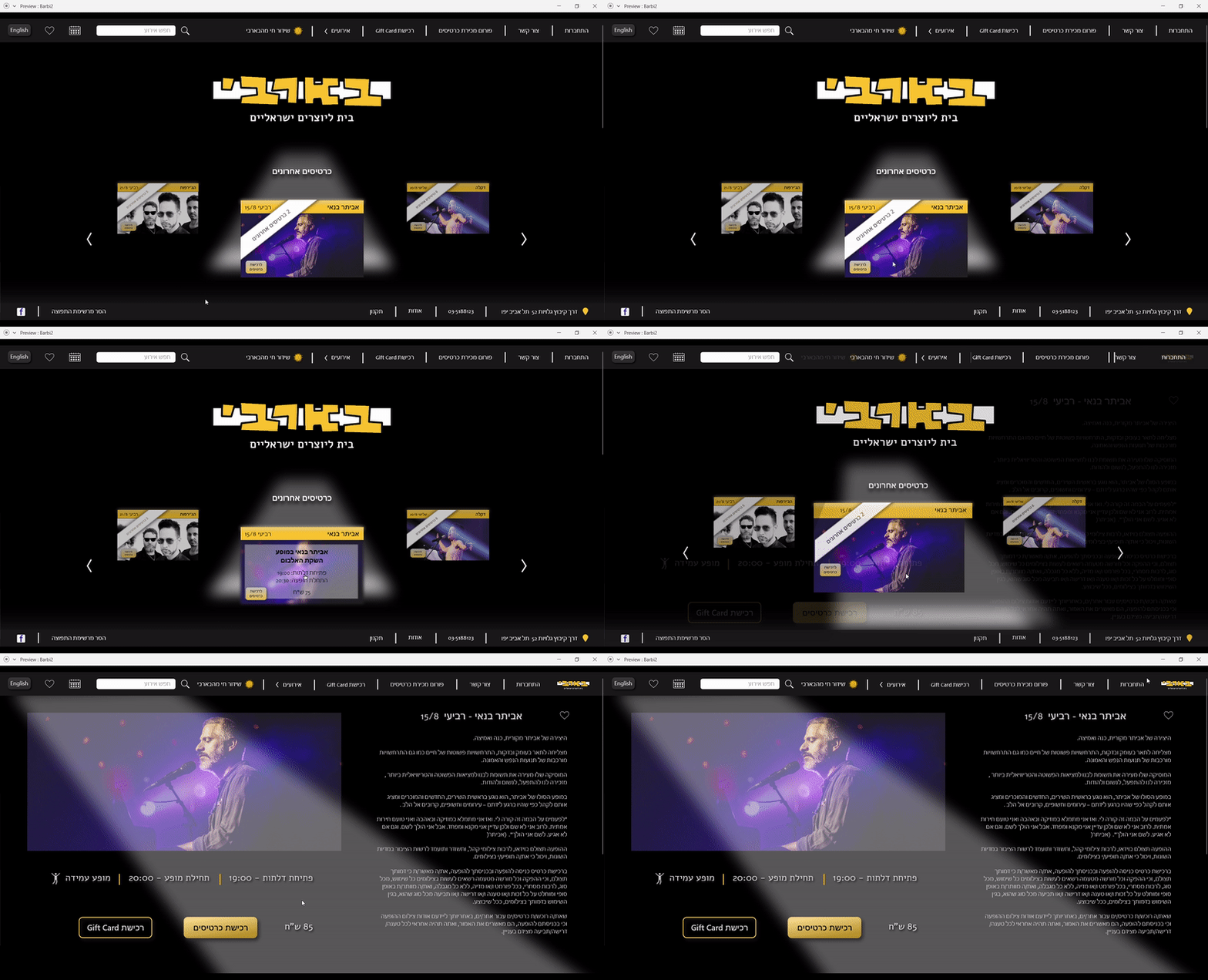
An Informative Artist Page
Clean page, designed with all the important stuff:
info about the artist and the show; option to buy tickets or a gift card; listen to the album directly; provide links to relevant websites and a "like" button

The Result
