top of page
Brooklyn Pizza
Responsive landing page for "Brooklyn Pizza" restaurant
Tools used: Adobe XD , Photoshop


.png)


Anchor 1
The Mission
Presenting the brand
Present the brand and its products on the best side
Providing information
To provide information on different branches and show the restaurant menu
links to the branches sites
Direct links to the customer’s local restaurant for ordering a delivery
Responsive
Designing a responsive page that is available on desktop and mobile view
Anchor 2
Web Solution


Interactive menu
For the user’s convenience, I designed an interactive menu that shows the different toppings with an adaptive image of the pizza itself.

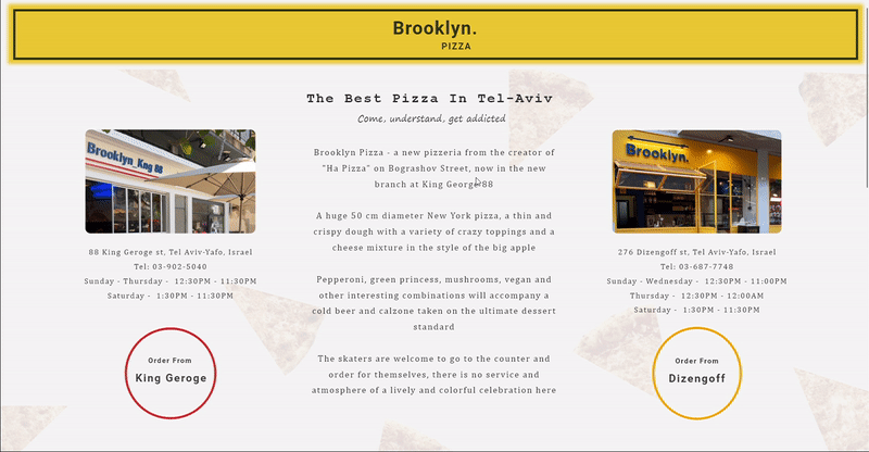
Links to the branches sites
& info about the brand
Due to various ownership issues, each branch operates on its own ordering platform.
The brand and branch information is presented clearly, as this is what users primarily seek.


Presenting the brand
As users scroll down, they will encounter a gallery showcasing the brand and its products. The images capture the restaurant's ambiance and the distinctive vibe of "Brooklyn Pizza."
Anchor 3
Mobile Solution
.png)

A scrolling menu by categories
The mobile challenge was to find a way to optimize the interactive menu so that it retains all the relevant details and functions just like it does on desktop.
By designing a scrolling menu a filter categories, I succeeded in keeping all the menu details on one screen.
The users can easily choose the type of toppings they want to get more info about them, and even see how they look on the pizza.
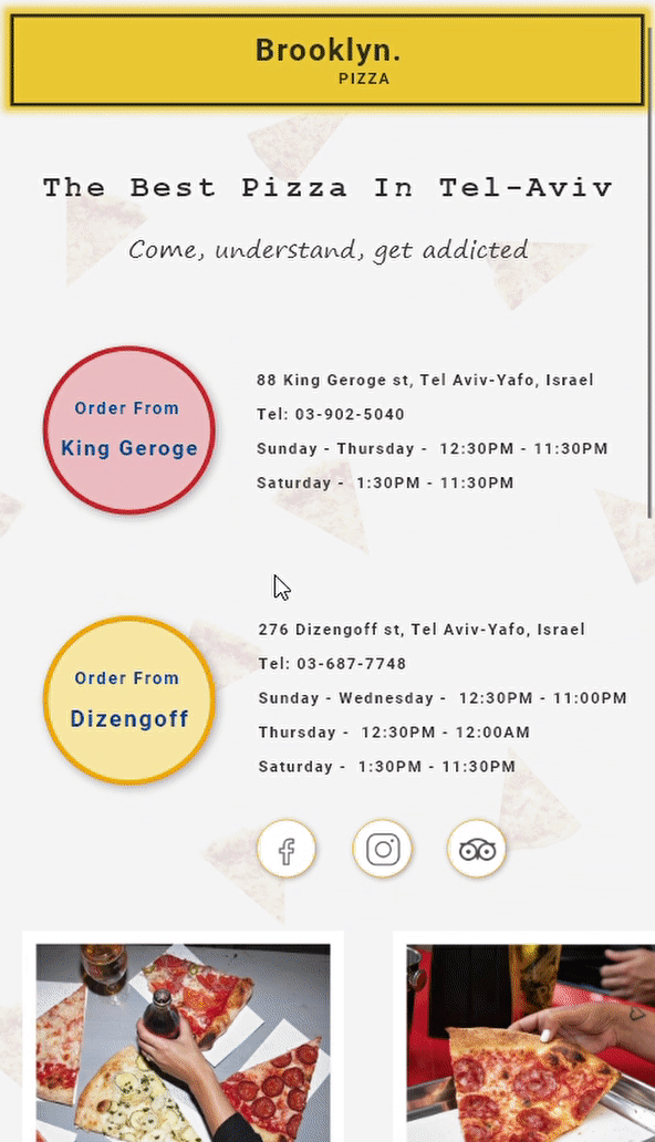
Branches info and links
In the mobile view, I've adjusted the communication approach with users.
Mobile users typically prefer quick and efficient interactions, whereas desktop users tend to spend more time learning about the brand.
Therefore, I've decided to exclude brand information and focus solely on restaurant details and a quick link for orders.
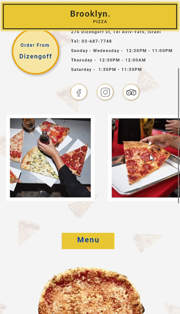
Scrolling Album
The scrolling gallery remains the same as the desktop view.
Easy to operate from mobiles.
Anchor 4
The Design
I choose to design the website with the same aesthetic look as the brand branches.
Each branch have a unique vibe with different colors


#00429A
#F5F5F5
#EFC32D
#F9E5A1
#EFC2C0
#D53831
Anchor 5
The Result


Desktop view
Mobile view
.png)

bottom of page